Our First House: Bathroom Inspiration
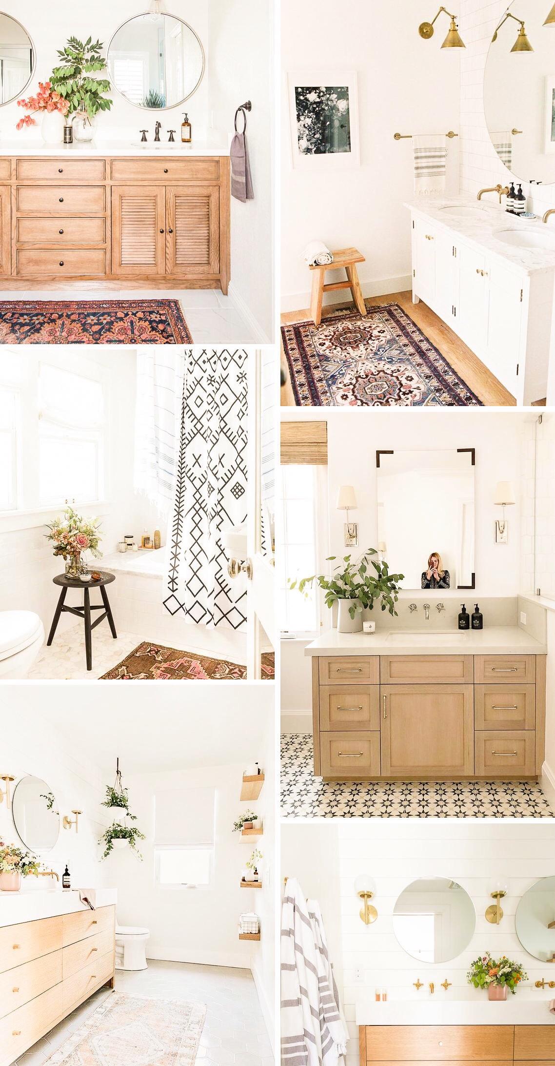
The bathrooms weren’t rooms I was most excited to decorate in the beginning, but they’ve ended up being much more fun than I imagined. With them being smaller spaces, they’re the quickest to style — AKA quick gratification, which you gotta love when you have an entire house of your own to decorate for the first time! Keep reading for everything my we plan to include in our master and guest bathrooms, the images we’re pulling inspiration from and what elements we feel really creates the best bathroom space.
If you want to read this series in order, check out my previous posts below:
- Our First House: Kitchen Inspiration
- Our First House: Entryway Inspiration
- Our First House: Dining Room Inspiration
- Our First House: Living Room Inspiration
HERE’S WHAT WE’RE THINKING
I find the best bathroom setups to be minimal, clean and relatively neutral since it’s likely a place where you’ll be relaxing, winding down for the night or getting ready in the morning. We hadn’t put much effort into decorating our bathroom at our old apartment, so I knew we were pretty much going to need all new stuff this time around and x2 since we have an additional bathroom. We want to stick to our budget while still creating a space that’s updated and well styled.
If you like this inspiration, click the top left corner of the image to save it to your Pinterest board!
Elements we’re planning to incorporate:
- Round mirrors
- Boho-inspired shower curtain
- Basket trash cans
- Textured rugs/bath mats
- Plants
- New light fixtures (possibly sconces?)
- Rubbed-oil bronze accents (shower curtain rod, towel rack, faucet, etc.)
The first upgrades we’ve already made were removing the standard rectangular, unframed mirrors off the wall. We replaced them with two round mirrors in the master bathroom, and one in the guest bathroom. We also picked out some very boho-vibes shower curtains from Target and they seriously did so much for the space! I plan to paint the vanities the same color that I’ll be using for the kitchen caabinets (a greyish green/blue — I have the paint but haven’t swatched it yet, so we’ll see).
We already have grey bath mats and rugs leftover from our apartment, so we’ll use those for the time being until we find something we like more. The floors are grey, so I think solid grey rugs blend in too much. I love patterned ones to add a splash of color to the space, so we’ll probably go that route once I stumble along the perfect ones!
The flooring may be something we redo at some point, but for now I don’t mind it. I do really like the small white and black tile you see in some of the images above, so maybe we’ll end up going that route. As for the light fixtures, I’m torn on which route I want to do. I kind of like the look of sconces, so maybe we’ll do those in the master and standard strip lights (but a cuter version) in the guest bathroom. If you have an recommendations for affordable sconces that put out great light for bathrooms, let me know!
That about covers it! As a heads up, I’ll do dedicated before and after blog posts for each room of our house as they get finished, but for now you can see sneak peeks on my Instagram story and YouTube channel. Thanks for stopping by & see you in Friday’s post!


