Everything an Awesome Blog Design Should Include
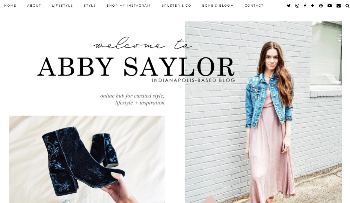
Happy Friday & welcome back to the blog! If you’re interested in starting a blog or want to take your current one to the next level, the design of your website contributes to your success. In fact, I think the quality of my blog design, paired with my content, has played a significant role in nailing brand collaborations. Your site is what connects you to others by communicating your message, and it’s one of the very first ways outsiders can begin to learn who your are. Keep reading for everything an awesome blog design should include.
I’ve had several people reach out to me to provide advice and recommendations on the design of their website, logo and content, so I thought it would be beneficial to do a blog post sharing my design, layout and composition tips. Let’s get into it!
Utilize color and white space appropriately.
There’s a proper balance between white space and your chosen color palette — use it wisely. I’d stick to one statement color while maybe adding a few additional shades within the same color family here and there. Personally, I think you should stick to only three colors at most to keep everything cohesive. If you’re wondering how you can implement your chosen colors, you can include them in a variety of places including your logo, linked text, subheads and buttons.
Implement effective navigation.
Otherwise known as the menu, navigation is how visitors/readers can find their way from page to page on your blog. This includes proper categories with consistent parent/child layouts (basically menu and secondary menu items), clear paths to be able to return to previous pages, and a search bar that can properly locate keywords. For instance, any key “call to actions” like newsletter signups should be located on the home page for easy locating. Consider what content is the most important and what’s the least important, then frame your navigation appropriately.
Prioritize fluidity.
Every inch of your blog should represent consistency and each page should, without a doubt, look like it came from the same blogger. This can be achieved with fluid composition, heading styles, image styles, post signatures, colors, shape and line elements, etc. Take a look at some of your favorite websites and consider why you like them. Chances are you can come up with a quick list that you can turn around and implement within your own site as well.
Be sure it’s easy on the eyes.
Avoid anything that’s too busy, crowded or harsh. If a new visitor can get lost on where to access new blog posts, find contact information or search tagged content, chances are you’ve got too much going on. If you’re the slightest bit worries that a reader could feel overwhelmed by your blog layout, make some changes. I do this buy keeping the home, post, contact, about and FAQ pages consistent and minimal.
Make it fun to explore.
If your blog is very generic and too simplistic, it’s likely that readers won’t be intrigued to click around to explore it. I like my blog design to serve as an experience, that way each person that passes through can get excited about what they see and naturally want to take in as much of it as they can. I enjoy rotating images, images that pop and are pretty to look at, collage layouts and magazine-like vibes, so that’s what I strive to make my blog represent. Make a list of what you love most about your favorite resources (online and print) and why, they evaluate your blog accordingly.
Express your personality + style.
Does a minute spent on your blog help a reader understand who you are and what your style is? It should to the best of your ability. Consider this: what will make people like to stick around and read your posts more than anyone else’s? To draw in the appropriate audience, be 100% yourself through all aspects of your website and exude a style that would appeal to the right people — including you! YOU should love your blog more than anyone else, so if you ever look at it and think, “maybe I can do better, this isn’t me,” make changes!
__________
If you found this information to be valuable, you’d probably benefit from seeing my post on the 30+ best WordPress themes for lifestyle blogs here. Feel free to send me a message any time and check out my creative shop (Bone & Bloom) if you want me to do any kind of design work for you.
After being super busy last week and having events or appointments to go to almost every night, the nasty cold that’s going around finally caught up with me! Needless to say my tissue box and nose spray have been my best friends lately. I’m feeling much better than I was at the beginning of this week, so I’m thankful for that! Thank you so much for reading — have a great weekend & look for a new post from me on Monday!


