Why Blog Makeovers Are Good For The Soul
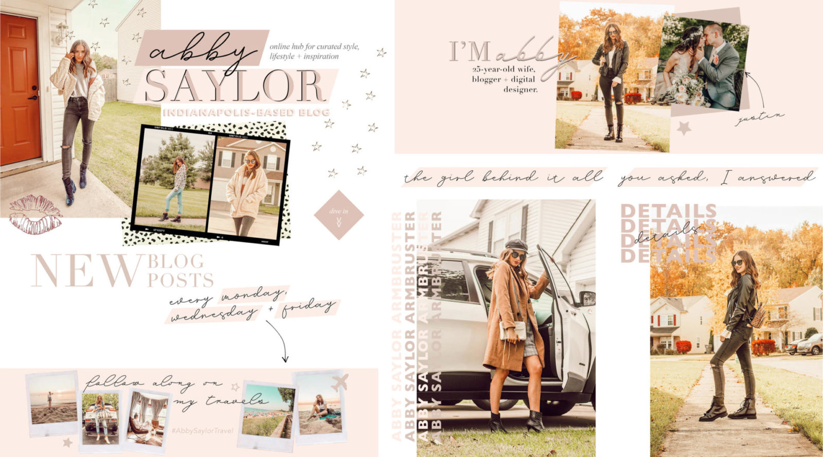
Hi everyone! If you’ve been following me for a while, you know how passionate I am about changing up the look of my blog pretty consistently here and there to keep things fresh. I put just as much work into the look and vibe of my site as I do with the content, and I find that a website that’s fun to look at and explore is a site that people are more likely to come back to. If you haven’t noticed, my blog got a little makeover this week featuring a brand new template, fonts and lots of little graphic touches throughout. If you’re into designing like I am, keep reading for details on all the changes I made + why blog makeovers are good for the soul.
WHY CHANGE THINGS UP?
Great question. Here’s why:
If you’re anything like me, boring is bad as a blogger. Boredom can diminish your creativity and make you feel unenthused about your blog. I find that the best way to kickstart your passion again is to give your online hub a little makeover. Whether it’s a new logo, different color scheme or a more exciting template, even the smallest of changes can make things feel fresh and exciting again. Remember how excited you were when you started? That’s doesn’t have to be a one time thing and with some tweaking here and there, it can be something you feel on a regular basis!
I’ve been in a little bit of a blogging rut lately, not in the sense that I don’t love what I’m doing, but that I’m feeling sluggish. A lot of my blog posts over the last few weeks have been written the day they go live instead of being written and scheduled for publishing ahead of time like I’ve always done. This is probably mostly due to my schedule, but likely also because the fire in me isn’t at its largest. My “simple” solution: spice things up! In come the changes that I’ll talk more about in a sec.
Not only is it good to change things up for yourself, but it’s great for your readers too. There are bloggers I’ve followed for years who’s websites have never changed, and while consistency can be good, it doesn’t make me excited to go to their blog and look around. For me, I find that reading blogs is a lot about the experience and I want my blog to set a tone for my readers the second it loads on their screens. Fresh equals exciting in my book, and even the smallest tweaks can make such a difference, especially for frequenters to your site. With that being said, let’s discuss everything new I’ve added.
HEADER
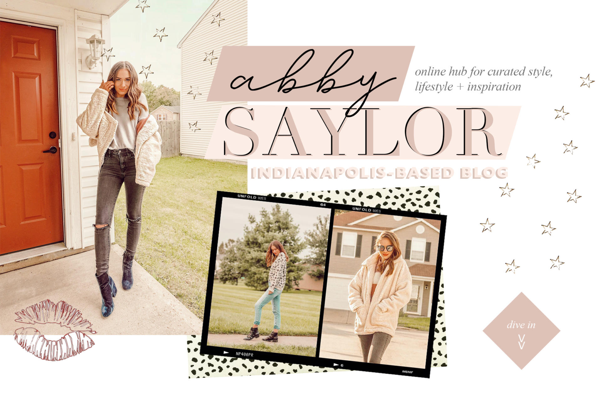
This header image is the first thing you see when you visit someone’s blog. I updated the overall look of mine (the layout, images, graphic elements, etc.) a few weeks back and only tweaked the “Abby Saylor: Indianapolis-Based Blog” fonts and colors this week. I wanted to change this part to pull together the fonts and colors that are now incorporated more throughout my website within the new template. I’m sticking with the magazine/collage vibe because that’s me and I’m just obsessed.
SECONDARY HEADER
Though you don’t see this graphic anywhere right now, I created this as a secondary logo of sorts that I can incorporate in the future if I choose to. I felt like I needed a smaller, more condensed version of the header on hand & I love how this turned out as well!
NEW POSTS IMAGE
I had been using a graphic similar to this for the same purpose before, but changed up the look of it and added the pink text highlights for a little something extra. I really like letting newcomers know when they can expect new posts from me and I think this graphic really helps with that.
PAGE TITLE ACCENTS


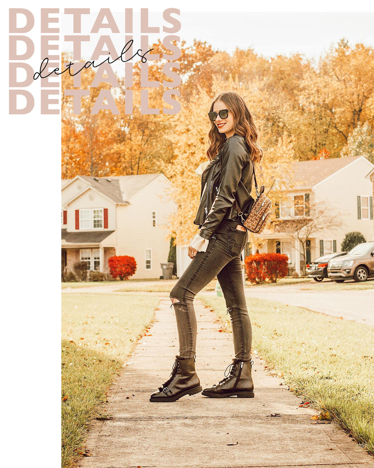
I had a variation of these page title accents everywhere already, but changed up some of the wording and added the pink highlighted strip behind the text for a little something extra. Going along with the magazine vibe, I imagine my blog being bits and pieces of words and images collaged together with handwritten-inspired fonts, highlighter marker effects, hand-drawn arrows, etc. These graphics tie in with the header image and keep everything cohesive. I’m super happy with them!
I’M ABBY + TRAVEL GRAPHICS
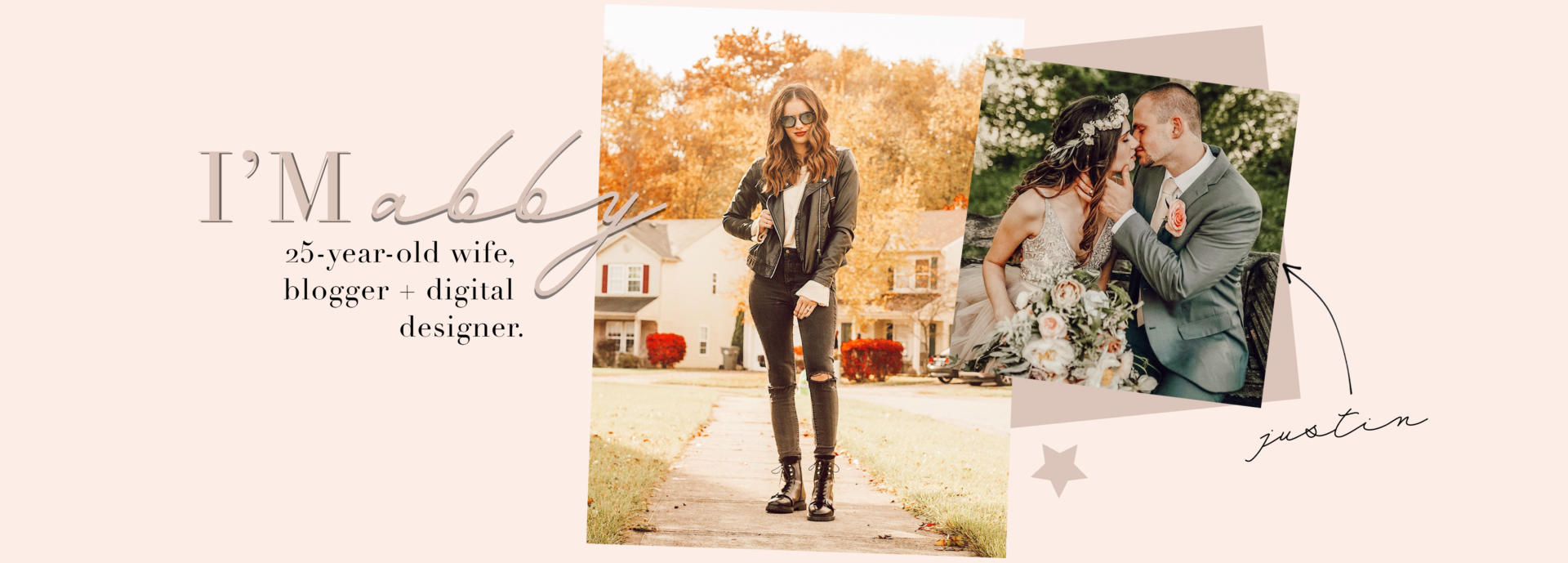
These have both been on my site for a while, but I decided to change the background colors from white to pink to break up the home page a bit. I also switched out the summer image of me on the “I’m Abby” graphic to a more season appropriate one. These were simple and quick changes, but definitely do a lot for the home page.
ABOUT ME + FAQ GRAPHICS
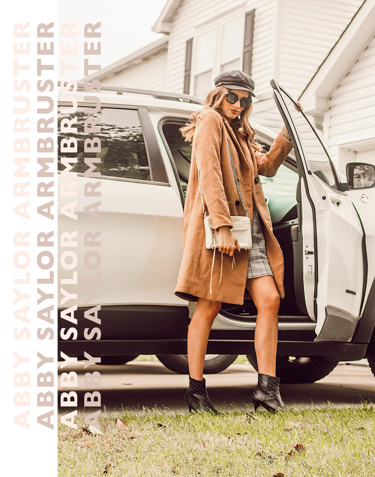
Last but not least, I changed the images on my About and FAQ pages to further flow with everything else. I was inspired by a lot of the graphic designs I’ve been seeing on Pinterest and from some of my favorite brands lately to create these concepts that don’t follow typical design practices. These two may be my favorites out of all of them!
__________
That’s all! I hope you enjoyed this little update and getting a behind-the-scenes look and what goes on in my mind when I change up the look of my blog — and most importantly, why I think you guys will benefit from doing the same. These little blog makeovers and refreshes always makes such a positive difference for me, so I wanted to use this post as an opportunity to inspire those of you who may be feeling sluggish and uninspired by your blogs currently. Enjoy the rest of your day and as always, thanks so much for reading!

