Behind the ‘Gram: What You Don’t See in the Instagram Photo
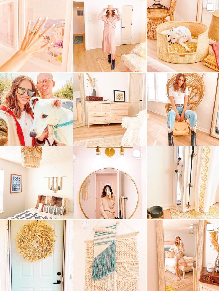
Hi everyone! I hope you all had a great weekend & welcome back to the blog! I haven’t done a post in my Behind the ‘Gram series since August, so I figured I’m overdue to give you guys a behind-the-scenes look at what goes into the photos you see on my Instagram feed. Sit back, relax and I hope you get a good laugh out of these stories!
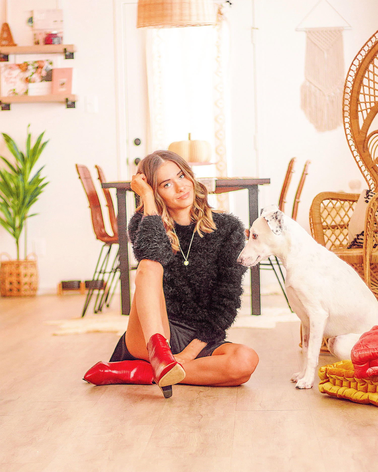
This photo almost didn’t make it to Instagram and was nearly scrapped entirely because Justin took all of the pics from this shoot SO wonky (love ya regardless, J 😘). He’s usually pretty good due to shooting pics for me so much over the years, but every once in awhile, I have to jokingly ask him if he was drunk or something. A good amount of the photos ended up being out of focus too and the poor lighting this day certainly didn’t help in capturing a good shot, but this one grew on me and ended up looking pretty good with some editing tweaks!

Some photos require way more editing than you’d ever guess, and this is one of those photos. I had to play around with the tones for a while to make sure the colors look accurate to how they do in person (specifically on the pumpkins) while still making sure the photo had somewhat of a filtered look to keep my feed cohesive. The biggest thing I edited out that you guys don’t know about is a large gray outlet with a cover that’s on the left portion of the siding. I found it to be an eyesore, so off it went! Removing it completely changed the photo for the better.
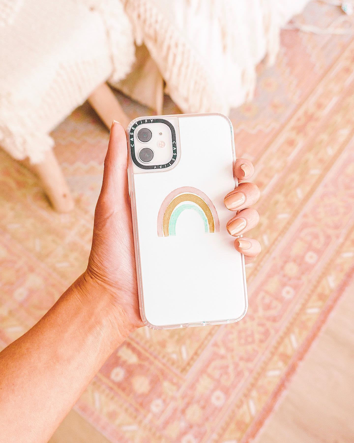
I love how this photo turned out, but would you have guessed that I shot it in multiple locations throughout the house and edited a few versions before deciding on this pic? This happens more often than I’d like to admit. It seems ridiculous for what appears to be a quick and simple shot of my phone case, and I agree. Regardless, and as basic as this photo is, it’s one of my favorites! This particular background ended up being perfect and I love the colors.

Mirror pics weren’t really something I was ever into, but they’ve grown on me because of the increasing (and shockingly good) quality of iPhone cameras. They’re a quick way to show off your outfit (and your environment!) and are really effortless — or so it seems, sometimes. This one, in particular, was frustrating me because it was posting in way worse quality on the Instagram app than it was outside of the app. Does that ever happen to you? There’s nothing worse than taking the time to make sure your image is sharp, only for the app the instantly reverse it.
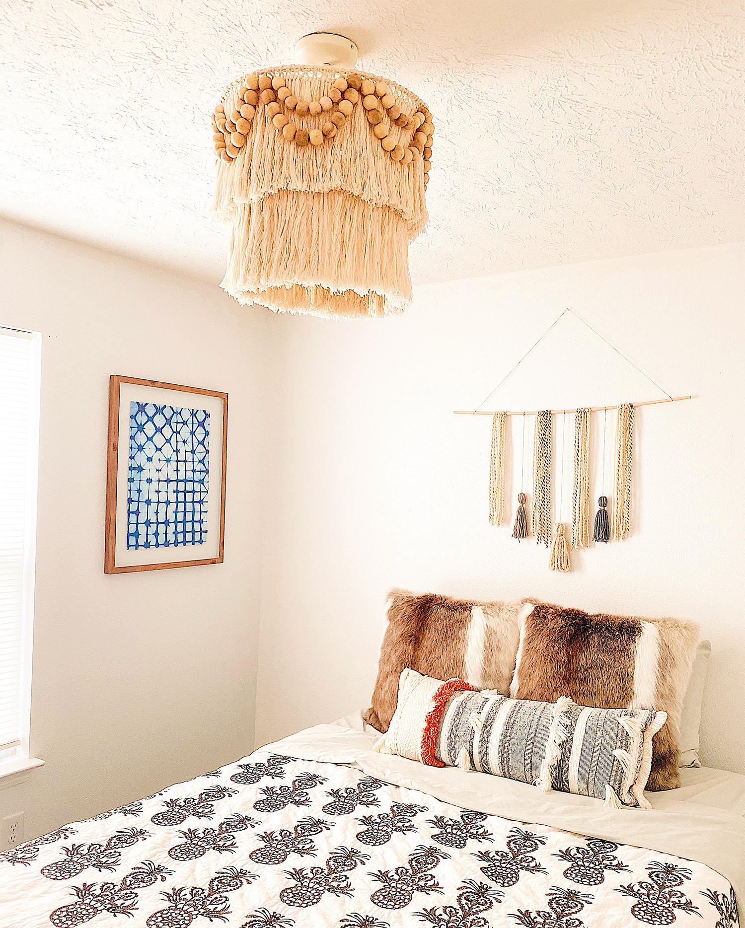
Can you believe I shot this one with both my DSLR and my iPhone and the iPhone one was better?! I played around with editing both images and the iPhone one ended up looking the most like I wanted it to. I truly never thought that day would come. This was a quick edit with the presets I’ve come up with in the Over app. Basically, you can copy and paste edits from one picture to the next, so I have a couple pictures saved in the app with edits I like that I’m able to quickly paste those onto other photos for a swift turnaround. If you’d like to know what my specific edits are, let me know!
__________
Those are the details behind some of my latest Instagram posts! I hope you found this entertaining and insightful when it comes to what really goes into the “curated” feeds you see on Instagram. I’m all about posting my real life and things I love, but I’m the first to admit that I can get way too wrapped up in the editing process when it comes to colors and stuff. Anyway, thanks for reading & have a great start to your week!