Blog Refresh: Everything That’s New Around Here
This post goes out to all of my fellow web design lovers out there because this stuff makes me GEEK OUT! I’ve been a busy bee since late last week updating my site, so I wanted to do a comprehensive post touching on everything that’s new here design-wise. I also thought it would be interesting to share a bit of my design process with you guys, including the outlines I usually make and more!
I get the itch to change up my blog every 6-12 months. As a designer, I always begin the process by gathering inspiration on Pinterest. This is where I come up with a lot of my color and font inspiration, and then I start building on my ideas from there. It really helps to make a Pinterest board dedicated to the project to compile everything that I love, or even more often, I prefer to paste each photo into a Photoshop file so I can move stuff around and see everything in one screen to create a mood board.
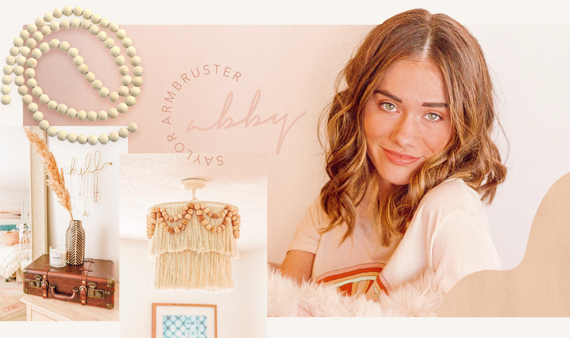
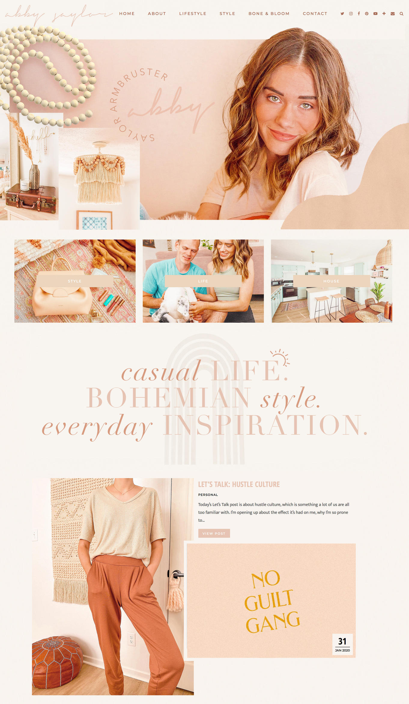
Before going into my site and making changes, I take a screenshot of my current webpage and make edits to it in Photoshop to see how everything is going to look ahead of time. This gives me the opportunity to play around with everything, place stuff in different locations and get really creative. This is honestly so therapeutic for me and the ideal way to get my creative juices flowing. Above is an example of this and the file I used to get this blog refresh going!
Here are the edits I’ve made so far:
New background
To switch things up, I changed the background of my site from white to a cream color. I hope this didn’t go unnoticed, but I realize it’s very likely that it did since the color I chose isn’t a huge change. 😂 I think swapping the color helps make my website stand out a bit more and, to me, it gives off a totally new vibe. It’s a bit warmer and almost paper-like. However, doing this doubled the amount of work I had to do because every graphic I’ve ever uploaded (including my post signature on every single post) with a white background no longer blends in. Needless to say, I’ll be working on swapping these out little by little for a long time.
New header/slider
I didn’t love the idea of having a big picture of myself at the top of my blog, but using a picture of anything else (at least any of my current ones) seems so random. To solve this, I decided to do a rotating header that would feature a variety of images so it’s not my giant head 24/7 (lol). I picked some of my favorite and highest resolution lifestyle photos to include in the slider. I want to take some new photos on the next sunny day we have to maybe swap them out with.
New font
As you may have noticed, my “Abby Saylor” header and other accent fonts throughout my blog are now in a loose, handwritten script. I wanted to incorporate a soft font that’s delicate and laidback, and I think this one achieves that vibe perfectly. I still have more accent headers to add/edit on various pages, but it’s getting there!
New colors
Though pink is always a constant, I like to switch up the other accent colors every so often just to keep things fresh. It’s so easy to get sick of things when you’re constantly looking at it, so this time I went with warm hues of a clay-like pink, cream, sand and a sienna brown. I kept the colors muted and dusty too for a soft look.
New images
Something else I always like to do when I do a refresh is swap out the images on my About Me and FAQ pages, as well as my profile icon on my sidebar. I selected photos with coloring that coordinated with the new look, which is easy to do since I edit my photos to all have that similar color scheme. I think it’s also important to utilize up-to-date pictures that are less than a year old as well.
__________
I think that’s everything for now! Don’t be surprised if you see a few more new things over the next week or two. Like I said, I’m still in the process of adding final touches, but I’m really happy with the results so far. I hope you love it as much as I do! Thanks so much for stopping by to read this little update — I have a life update coming your way soon!


It looks amazing! Congrats on the changes.
XO
Mariah
https://moosmusing.com
Thanks so much, Mariah! 💗
Love the changes! Everything looks so so good.
Xo, Gigi
http://www.gigitrends.com
IG: gigitrends
Thank you SO much, Gigi! 💕