5 Quick Tips to Improve Your Blog’s User Experience
I get emails and DMs all the time from you guys asking how you can improve your blog, brand it and make it more user-friendly from a functionality perspective. Today I’m touching on one of those steps, which is one of the most important focus areas in the development process: improving user experience and the overall flow of your website. To get people to come back to your site and increase your page views, it’s important to have a blog that works just as good as it looks with easy navigation. Keep reading for 5 quick tips to improve your blog’s user experience!
Don’t make people hunt for your blog posts.
The whole point of having a blog is publishing blog posts for people to read, so if they have to click away from your home page to locate content, you’re decreasing your likelihood of getting views. I suggest having 3+ blog post previews on your home page where readers have multiple posts on their screen to intrigue them, leading them to click to read more of what appeals to them. Having a few post options in sight allows them to see a few different topics you’ve written about, where hopefully one of which is something they’re interested in.
Have a clear, easy-to-find contact page.
It’s probably safe to assume that you want to work with brands. How that often happens is by them coming across your blog or social media, then locating your email and reaching out to you from there. Don’t make them hunt for your contact information, because chances are they’re reaching out to anywhere from a couple to a large handful of people and you may be eliminated from that list if it takes more than a minute or two to locate your email address. Personally, I suggest utilizing a contact form and listing your email address on the same page as well so they have a couple of communication options.
Use your menu and categories effectively.
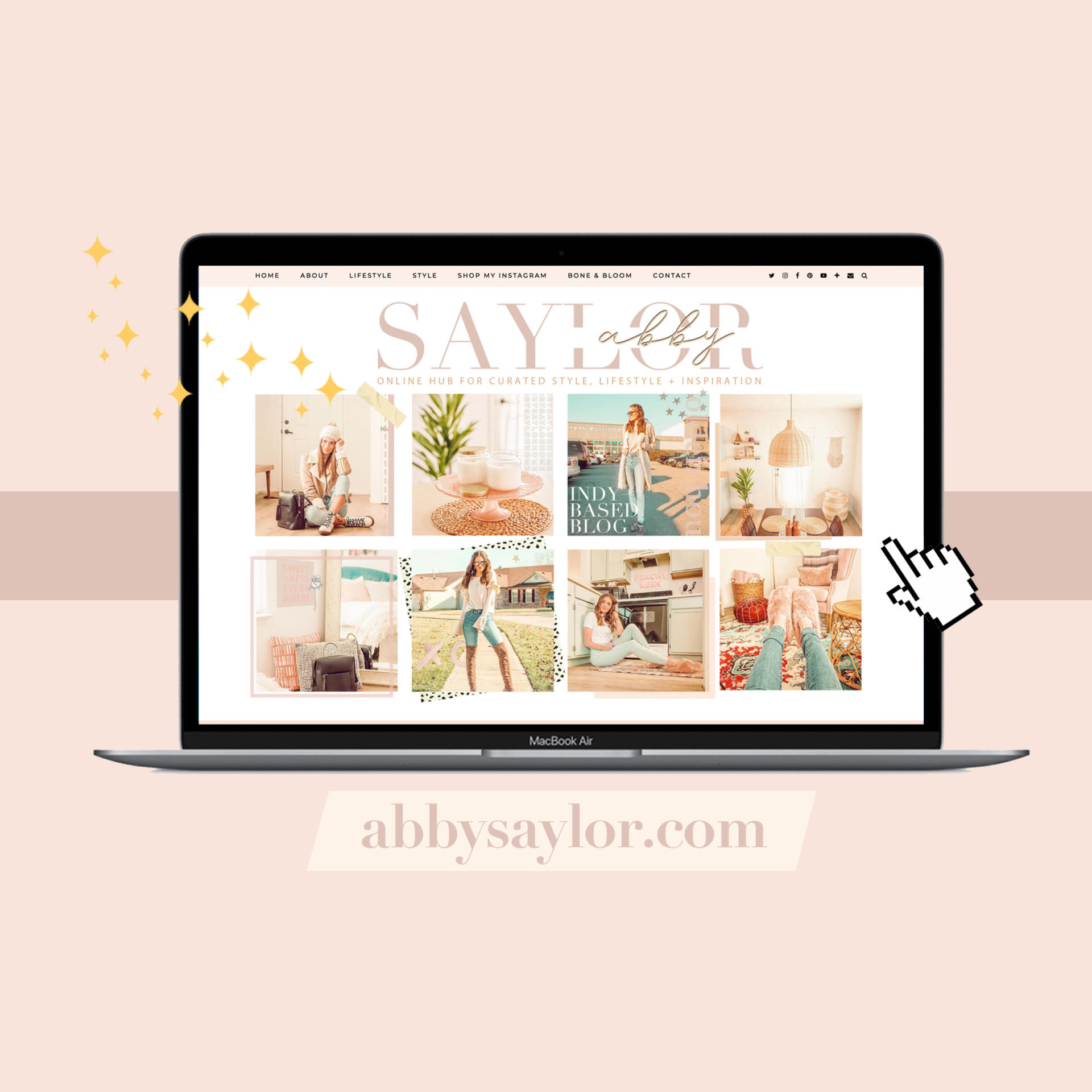
Your menu is one of the most important (if not the most important) elements of your website. This is how people navigate through your blog and reach whatever they’re looking for, and you want to make that process as smooth, easy and hassle-free as possible. Here are some effective menu items to incorporate:
- Home — give them a button to press that can route them back to the home page in case they saw another post there that they wanted to check out
- About — this is self-explanatory, but give readers a place to find out who you are and what you’re all about
- Categories — break up your blog posts into categories to increase page views and make referring back to old posts much easier
- Contact — I already spoke about this one, but make it a parent category so people don’t have to sift for it
- Social media links — make following you on all your platforms easy with noticeable profile links
A good looking blog is useless if people can’t navigate it, so don’t make it more complicated than it needs to be!
Make sure your blog posts are dated.
This lets people know when you post and how often, so be sure your post date is visible on the home page. This shows brands and potential new readers how consistent you are/aren’t and how often they can expect new content. If your template doesn’t show this currently, there’s likely a checkbox you need to mark to make that visible.
Always have a search option.
Most, if not all templates will come with a search option, but be sure it’s activated on your blog. I think this is mostly effective for when readers come back to your blog to revisit a post they read a while back. It also allows people to search any brands you’ve worked with, specific keywords and all that good stuff. I would place it somewhere that’s easy to find and clearly labeled within your blog.
__________
This may have been self-explanatory, but I see so many blogs that don’t incorporate these elements and it truly makes such a positive difference when these are implemented. If you’d like any help designing your blog or giving it a little extra boost, feel free to reach out to me for a quote: boneandbloom@abbysaylor.com. Thanks for reading & see you in Friday’s new post!


Love this post! It’s my biggest pet peeve when people don’t date their blog posts! It’s one of those key things to ensure I can easily be sure if something is still relevant!
xx Caroline
http://www.whenwear.com
SAME, huge pet peeve! It’s so helpful to know how consistent people are (or aren’t) so you know when to come back for more content!
These are great tips! Reading blogs is so much more enjoyable when they’re easy to navigate.
Thanks so much, Molly! I couldn’t agree more!