Behind the ‘Gram: What You Don’t See in the Instagram Photo
Welcome to the second installment in my “Behind the ‘Gram” series sharing what goes into every photo you see on my Instagram feed: the good, the bad, the awkward and the struggles. A lot goes into that “effortless” Instagram feed you see from your favorite people to follow, and I find these behind-the-scenes elements to be so funny. Keep reading for what went into five of my recent Instagram posts!
If you’d like to read the first post in this series, click here.
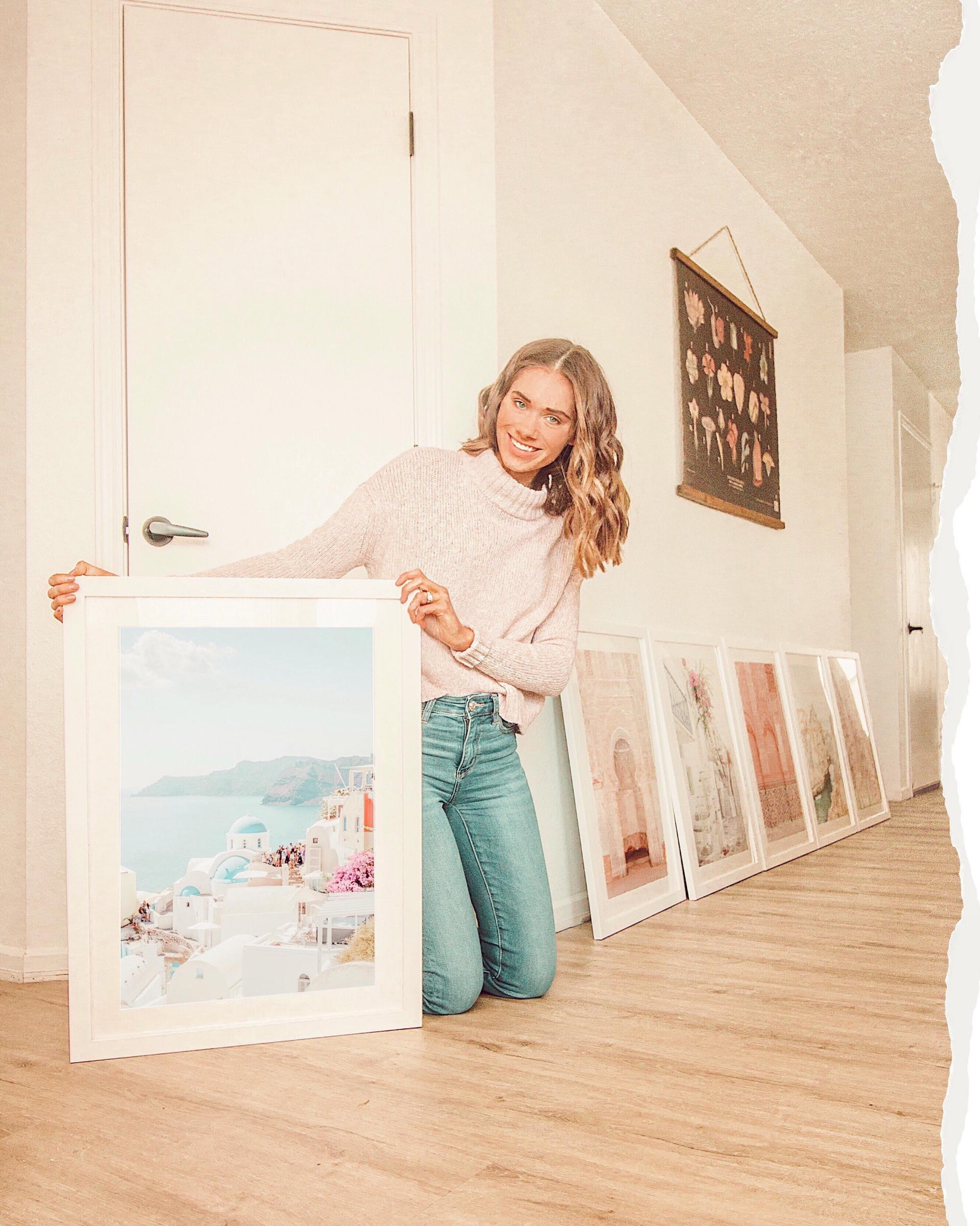
This one was fairly easy to edit since it already oozes with my color scheme, but taking photos of prints can be tricky. I had to go onto Society 6‘s website, take a screenshot of this print I’m holding, edit it separately with the presets I use and overlay it onto this image so it wasn’t washed out. Isn’t that a lot of work for an Instagram photo? Absolutely, but I love how it turned out! I added the torn image detail on the right side in Photoshop and I’m super happy with the result.
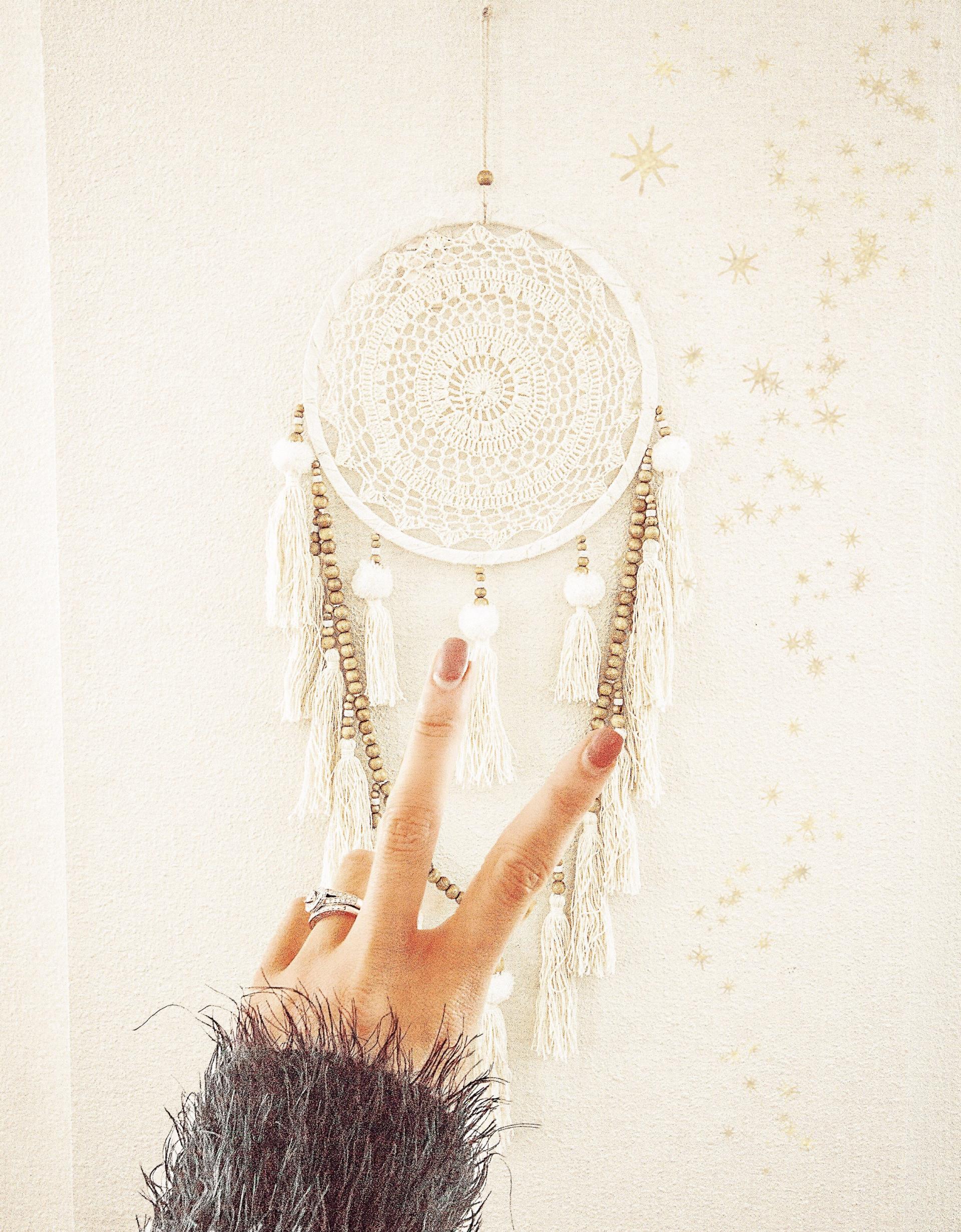
For real, I went above and beyond to make this photo work. This final image is actually my hand cut out from another shot and laid on top of this background in Photoshop because I liked the elements of two different images best. When you’re trying to stick with a theme for your feed, I’ve found that some images are just harder to get to match — and this was one of them. It was a tough balance to keep the image bright, but not too white-toned since my feed is fairly warm-toned and creamy. There was a lot of back and forth between making edits, comparing it to my other images in my feed, then making more edits, etc. I added the sparkle element last and it was good to go!
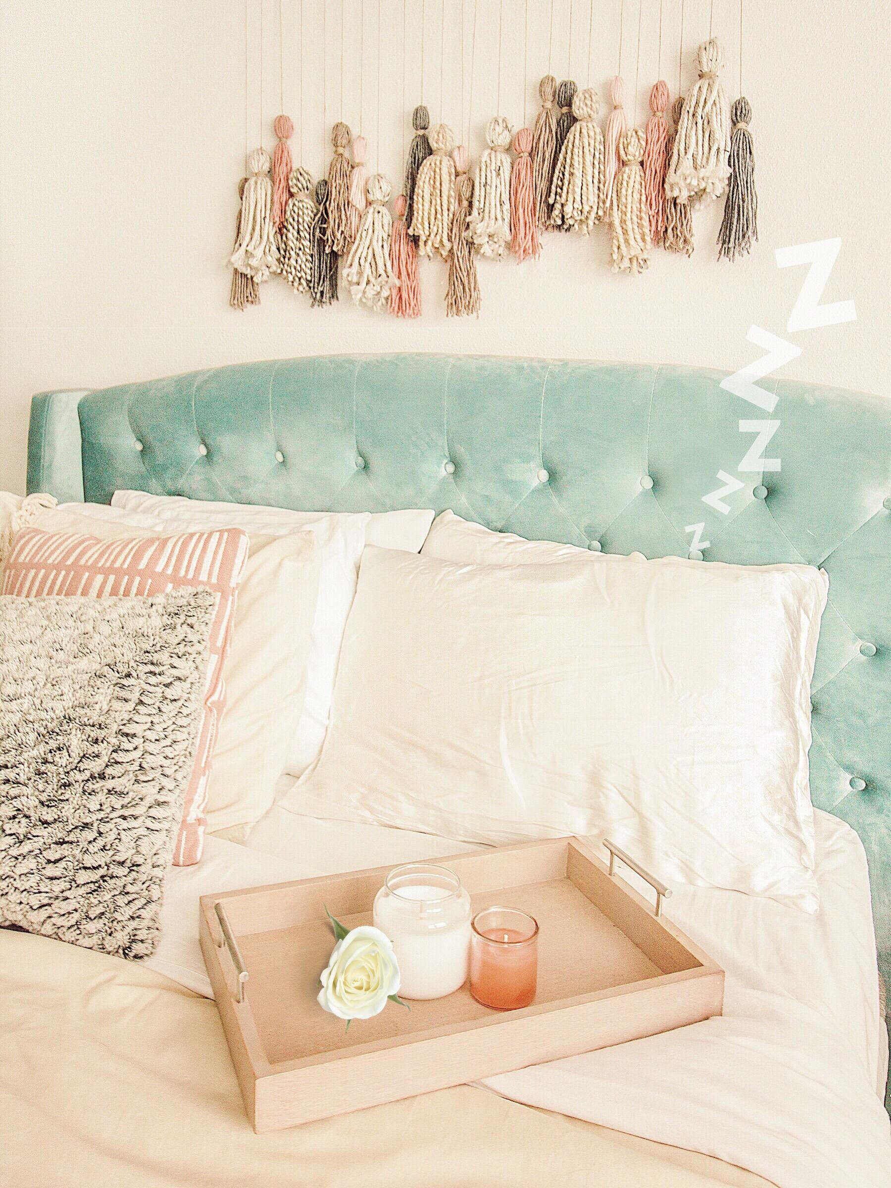
This photo was to promote a blog post I did reviewing my experience using silk pillowcases for the first time. On a sunny day, the lighting in our bedroom is phenomenal, so this was a pretty easy image to take. The photo seemed a little basic to me once I finished up my usual edits, so I added the Z’s and the rose for a little something extra. As a designer, these graphic elements completely make the photo to me!
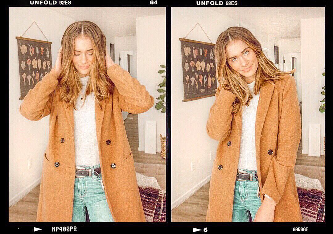
This one was a tough one. I seriously edited it for over an hour and I almost didn’t post it because I couldn’t get it to match my feed. Sometimes the lighting in photos just doesn’t work, and that’s so frustrating when it’s an image I’d love otherwise. I had to completely change the background to a warmer peachy tone and doing so instantly fixed it — honestly, it’s kind of annoying that I didn’t come to that conclusion sooner, but what can you do 😅. There is so much work that goes into editing an Instagram photo sometimes, it’s almost embarrassing to admit. Some images come together in minutes, and others take hours of tweaking. If you’ve ever looked at my feed and thought “wow, it all flows together so effortlessly!” wrong, I tried really hard, you guys. 😂
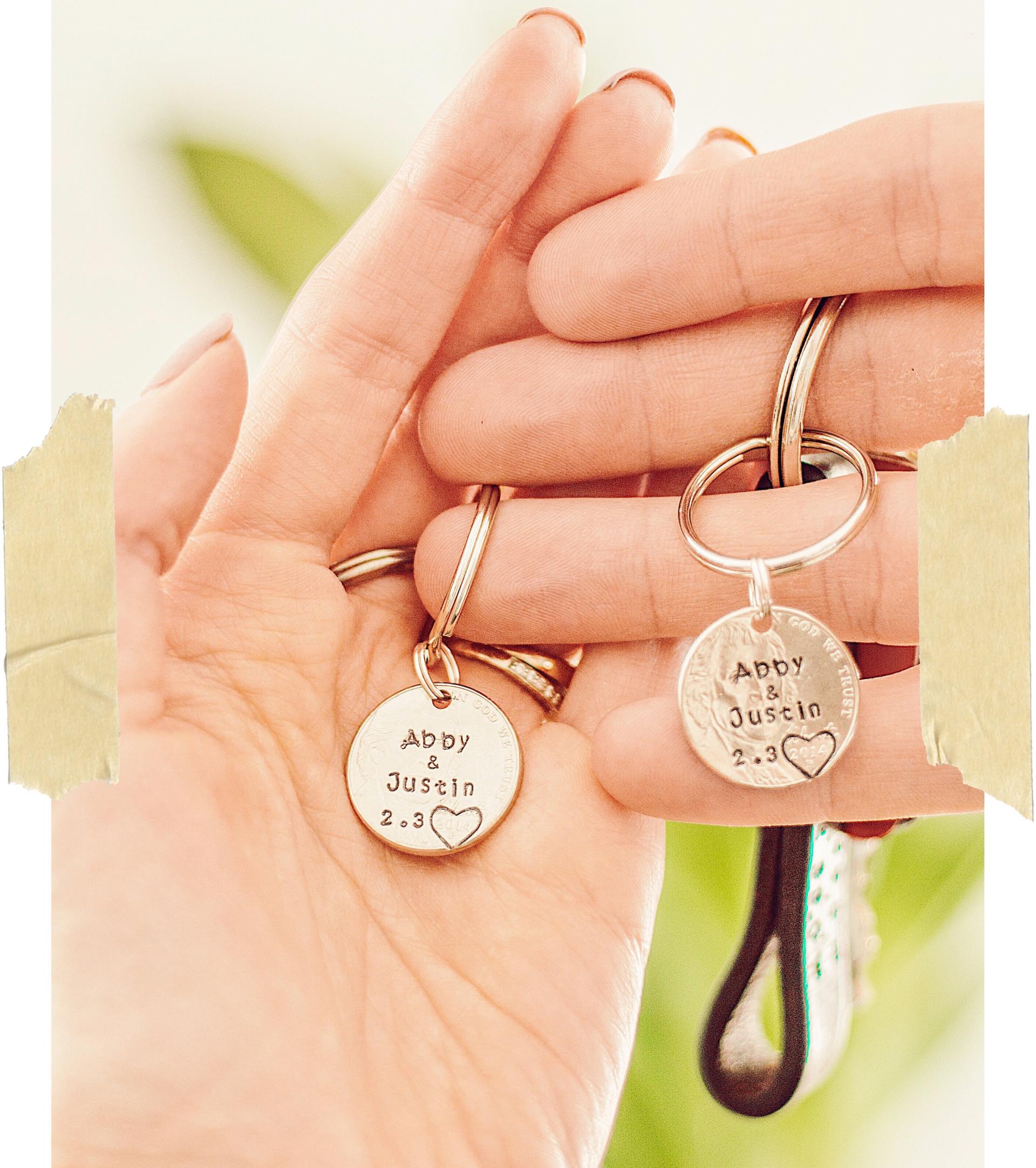
It was nearly impossible to capture this photo in focus! I used my Canon Rebel t3 with my EF 50mm f/1.8 STM lens (a fixed lens that doesn’t zoom) to get this shot, and you have to remain completely still for the image to not be blurry. I had to lean back while our arms were stretched out in front of us to get the desired distance and it took about 50 tries to get a couple good ones. It was also difficult to get both of your keychains in focus since it only wanted to focus on one. You’d never know that with how the picture I posted looked!
I hope you enjoyed this behind-the-scenes look at my Instagram photos! I find it so interesting to share these stories and the details of how the image is created can be so entertaining and just funny. Thanks so much for reading & see you in my new post on Friday!

OMG what a fun series!!! Love all these photos and how you edit!
http://www.mollyonthemoveblog.com
Thanks so much, Molly! I always love writing these and cringing about how much time I put into Instagram photos 😅
I love love love this series and am always SO impressed with all the editing you put in. I’m proud of myself if I put in the effort to photoshop out a mark on a white wall 😂 but thats nothing in comparison
http://kaylainthecity.com
Such a great feed! Instagram can definitely deceiving but yours look great!
Briana
https://beyoutifulbrunette.com/